I know, I know… I just redid my branding at the beginning of the year but…
While I liked the clean, classic feel of the navy/grey colors and using my signature as my logo, it just didn’t really feel like me, you know?
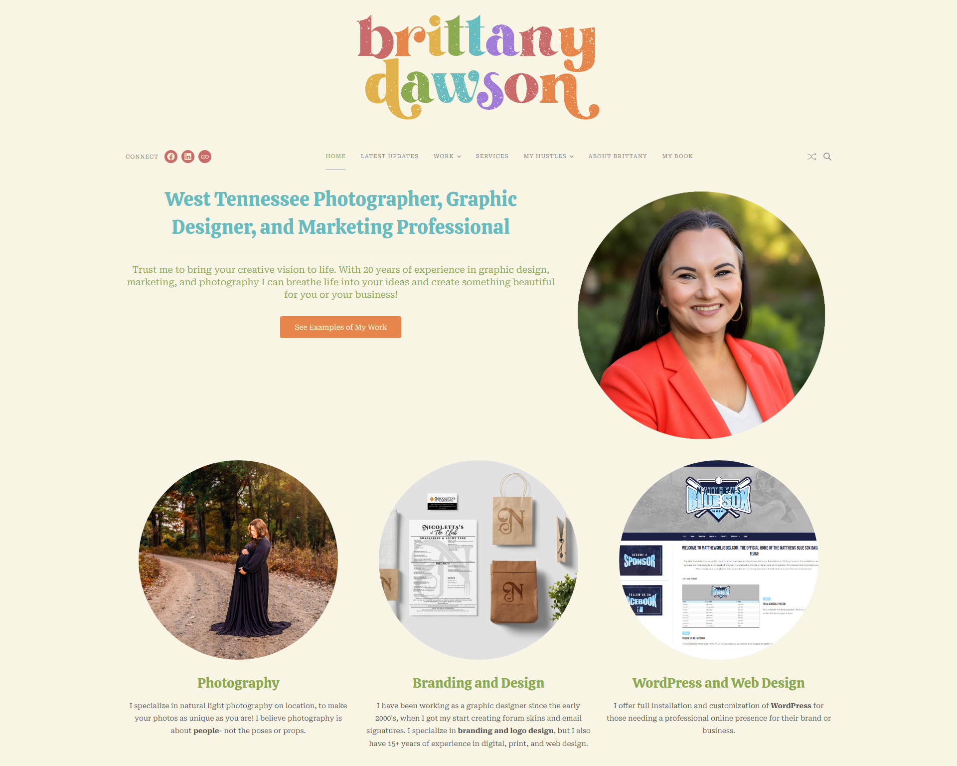
Anyone who knows me knows I LOVE color, and I have a weakness for all things nostalgic and fun. With that in mind, I kept feeling like I needed to update my branding to reflect me and my personality a little better, and I came up with this!
![]()
I am in LOVE with the colors and how this turned out! I think it perfectly captures who I am, my style, and my love for color.
As you can see, the site has been redone with the new logo and graphics to match. The retro typography and the color scheme reminds me of growing up in the 80’s, when everything was all about rainbows and serif fonts.
What do you think? Do you think this fits me better?